
Constructing Renko Charts Using Python
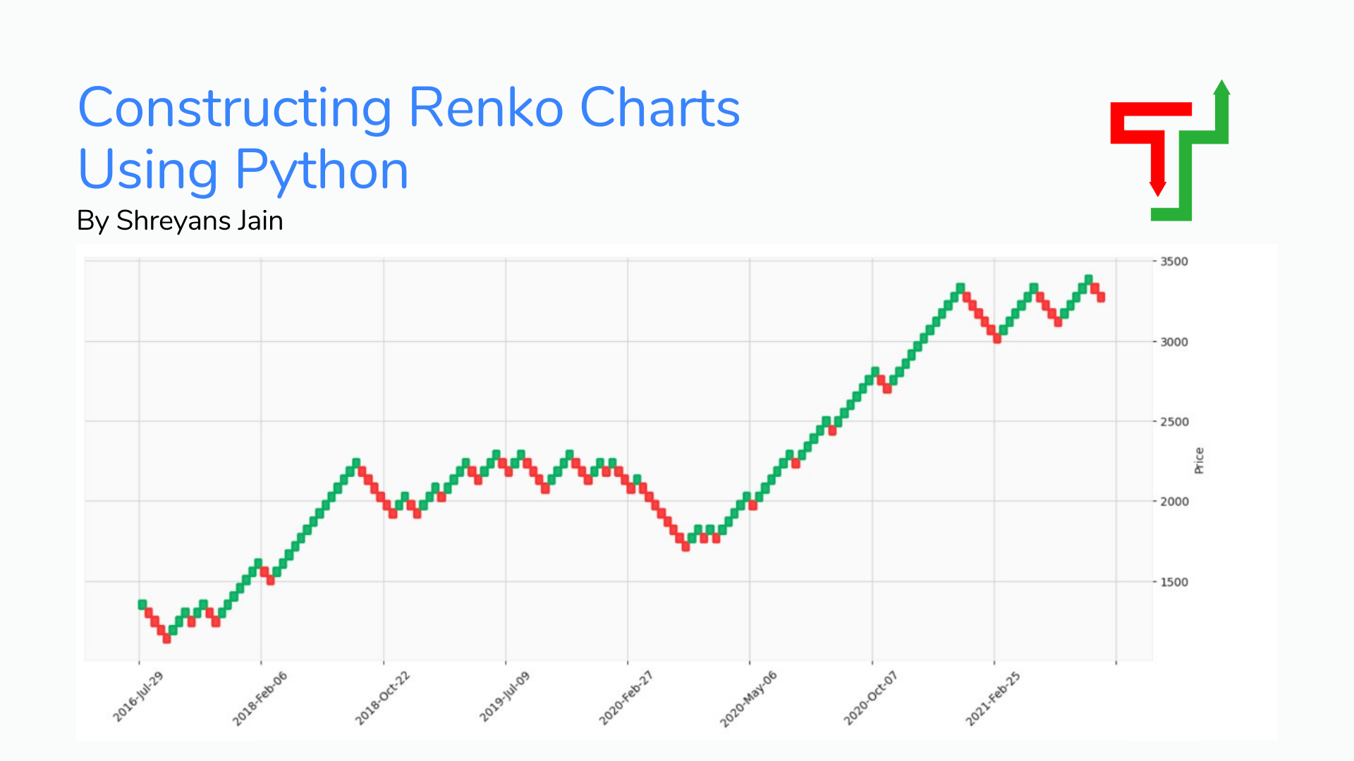
Renko originated from the Japanese word Renga, which means brick. Renko Charts are built using price movements, unlike other charts, which use price and standardized time intervals. When price moves a certain amount, new brick gets formed, and each block is positioned at a 45-degree angle (up or down) to the last brick.
Let's look at both the candlestick and Renko chart for Apple stock. (Feel free to play with the charts)
Renko Chart for APPLE Stock
Candlestick Chart for APPLE Stock
As you can notice, Chart 1 (Renko) is much cleaner than Chart 2 (Candlestick), and that is precisely the beauty of Renko Charts. They reduce the noise and gives us a clear indication of the trend.
Now, let's talk about the different methods to plot Renko charts, and later we will discuss its python implementation and the pros and cons of using this charting type.
Disclaimer: Article for educational purposes only; no trading advice is being given or intended.
Possible Implementations
Method 1: Using Fixed Price Bricks
For example, let's take a stock whose price is $500 we fix the price change for the bricks to be $10. That is when the price is $510 - Renko chart will paint green brick. Similarly, when the price hits $490. The Renko chart will paint red brick.
Method 2: Using percentage change for painting bricks.
Example:- When the stock price increase by 1%, the Renko chart paints a green brick. When the stock price increase by 1%, the Renko chart paints a red brick.
TIP:- For various investment horizons, it's good to adjust the percentage accordingly. An ideal approach to use is:
0.25% - 0.5% - For Short Term Investment
1% - 1% - For Medium Term Investment
3% - 5% - For Long Term Investment
Method 3: Using Average True Range(ATR)
ATR is the most common method used for Renko charts in the industry as it's dynamic.
ATR is a measure of Volatility that fluctuates with time. The fluctuating ATR value will be used as the box size in the Renko charts.
For this article, I have used the ATR Technique to plot Renko Charts.
Python Implementation
Step 1: Installing the necessary packages and libraries
pip install yfinance # for getting OHLCV datapip install mplfinance # for plotting Renko charts
Step2: Importing necessary libraries
import datetime as dt
import yfinance as yf
import pandas as pd
import mplfinance as fplt
Step3: Getting OHLCV data
start_date = dt.datetime.today()- dt.timedelta(1825) # getting data of around 5 years.
end_date = dt.datetime.today()
ticker_name = "TCS.NS"
ohlcv = yf.download(ticker_name, start_date, end_date)
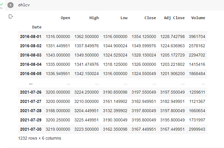
We are downloading five years worth of data from Yahoo Finance using the yfinance library. Once downloaded, the ohlcv dataframe should look like the below.
Step4: Defining Average True Range function(ATR)
The Average True Range is specified with the below formula, in short, it is calculated by calculating three ranges
High Price (for that day) - Low Price (for that day)
High Price (for that day) - Adjusted Close (for the previous day)
Low Price (for that day) - Adjusted Close (for the previous day)
MAX of all the three above is our True Range, we calculate this True Range for a number of days and then use the Average of this True Range as Average True Range (ATR)
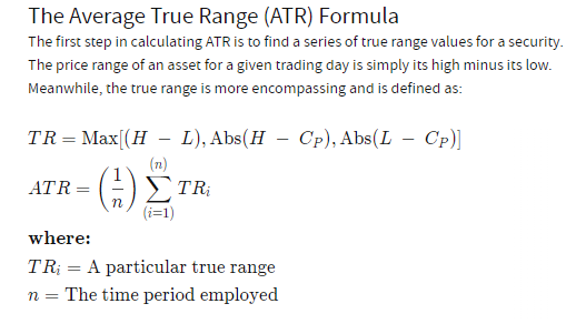
Source: Investopedia
I hope that makes sense; if not, please feel free to clarify in the comments below.
# Function to calculate average true range
def ATR(DF, n):
  df = DF.copy() # making copy of the original dataframe
  df['H-L'] = abs(df['High'] - df['Low'])
  df['H-PC'] = abs(df['High'] - df['Adj Close'].shift(1))# high -previous close
  df['L-PC'] = abs(df['Low'] - df['Adj Close'].shift(1)) #low - previous close
  df['TR'] = df[['H-L','H-PC','L-PC']].max(axis =1, skipna = False) # True range
  df['ATR'] = df['TR'].rolling(n).mean() # average –true range
  df = df.drop(['H-L','H-PC','L-PC'], axis =1) # dropping the unneccesary columns
  df.dropna(inplace = True) # droping null items
  return df
Step 5: Calling ATR function
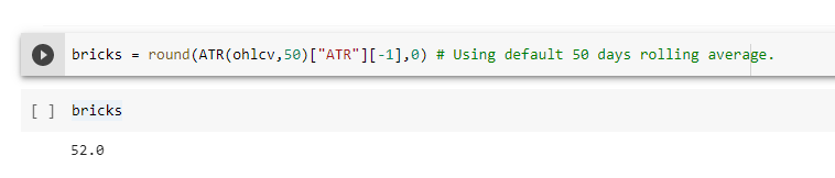
We call the ATR function with n=50, which means that we are going to use the average true range for the last 50 days.
print(ATR(ohlcv, 50))
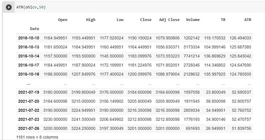
As you can see in the above example of TCS.NS the ATR has decreased from 126.5 to 51.84 Rupees on a 50-day rolling basis. So ideally, if we capture the latest ATR of the stock and consider that in our Renko chart, that would be more useful.
bricks = round(ATR(ohlcv,50)["ATR"][-1],0) #capturing the latest ATR
#rounding off the result to an integer.
print(bricks)
Step 6: Plotting Renko Chart
The most straightforward piece, thanks to the mplfinance library.
fplt.plot(ohlcv,type='renko',renko_params=dict(brick_size=bricks, atr_length=14),
          style='yahoo',figsize =(18,7),
          title = "RENKO CHART WITH ATR{0}".format('ticker_name'))
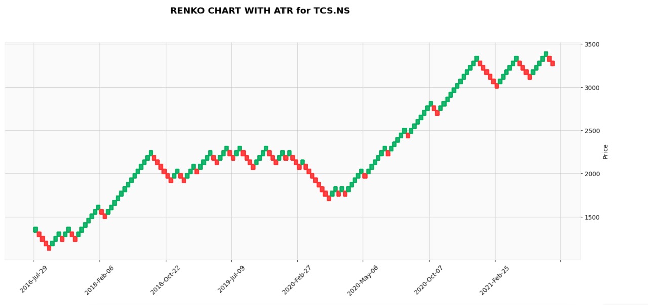
Great, so now you know how to calculate the ATR and plot Renko Charts using Python; you can now automate this metric, monitor some stocks, and deploy your trading robot.
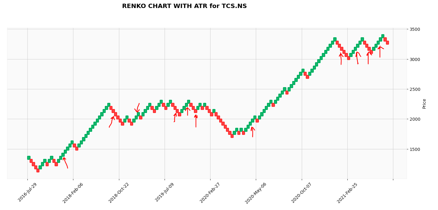
Trading Idea: Go Long on 3rd brick for three consecutive green bricks and go short on 3rd brick for every three consecutive red bricks.
Just for our reader's benefit, I had like to highlight not all is good with Renko charts; there are pros and cons to each and everything, and using just one indicator to do trading is not good enough for the modern world. Given that, here are a couple of pros and cons for you to consider.
Pros
Reduces all sorts of market noise.
Suggests clear levels of market support and resistance levels.
Works great for Price-Action type strategies because Renko charts only carry price elements; time is not considered.
Cons
The Renko bricks might not form a new brick every trading day if they are within a price range of the defined brick size, confusing traders.
The charts will miss price movement information if we choose a larger brick size (a larger range). What happens within this range is not shown in these charts.
Solution: Choosing brick size according to Average True Range(ATR)
- It is challenging to decide on an optimum setting to define the size of Renko bricks; there is no industry standard.
For a better understanding of code, complete code is available on Google Colab.
That's it. I hope you like the content. Constructive criticism is appreciated.
Feel free to reach out to me on Linkedin. If you have any suggestions about the blog, you can use the Feedback widget on the right hand of your screen, and if you wish to Contact Us, you can fill in the form here.
P.S We hope to connect with you via LinkedIn or any social media platform to discuss ideas and feel free to subscribe to the newsletter at the top of this article. You could also buy me a book to show some appreciation if you liked this article. 😇